Project: Mimarte Visual Identity
Mimarte, a distinctive and warm brand identity designed for an independent massage therapist. The project centered on crafting a logo that blends serenity, personal care, and a touch of charm through the symbolic presence of a cat, reflecting the therapist’s unique approach and personality.
My Approach
For Mimarte, I set out to create a visual identity that feels gentle, approachable, and memorable. Every element—from the color palette to the illustration of the cat—was chosen to evoke a sense of calm and trust. The design process balanced simplicity with character, ensuring the logo could adapt across various applications while staying true to the brand’s essence.
Vision and Innovation
The vision behind this project was to develop a logo that transcends generic wellness symbols. Instead of relying on traditional spa motifs, we introduced a playful yet elegant cat as a distinctive brand icon. Soft lines, harmonious typography, and subtle detailing created an identity that feels both professional and personal.
Identifying Unique Challenges
One of the main challenges was incorporating the cat element without compromising clarity or sophistication. The logo needed to communicate relaxation and care while remaining legible and versatile. Careful refinement of the illustration and typography ensured the final result was balanced and impactful.
Resolving Complex Problems
To achieve the desired tone, I explored multiple visual directions—from abstract icons to detailed drawings. Through iterative sketching and digital refinement, I developed a symbol that merged the silhouette of a cat with organic, flowing shapes suggestive of movement and comfort. This approach allowed the logo to stand out without feeling overly literal.
User-Centric Design
At the heart of the project was a focus on creating a logo that resonated with the therapist’s clients. The final design is welcoming and reassuring, instantly communicating the sense of personalized care that defines Mimarte’s services. The clean composition ensures excellent readability in print, signage, and digital formats.
Meeting User Needs
The logo was designed to be flexible and practical across a variety of uses—from business cards and social media profiles to treatment menus and merchandise. For the client, it became a foundational element of a cohesive brand presence that supports visibility and trust.
Detailed Elements and Features
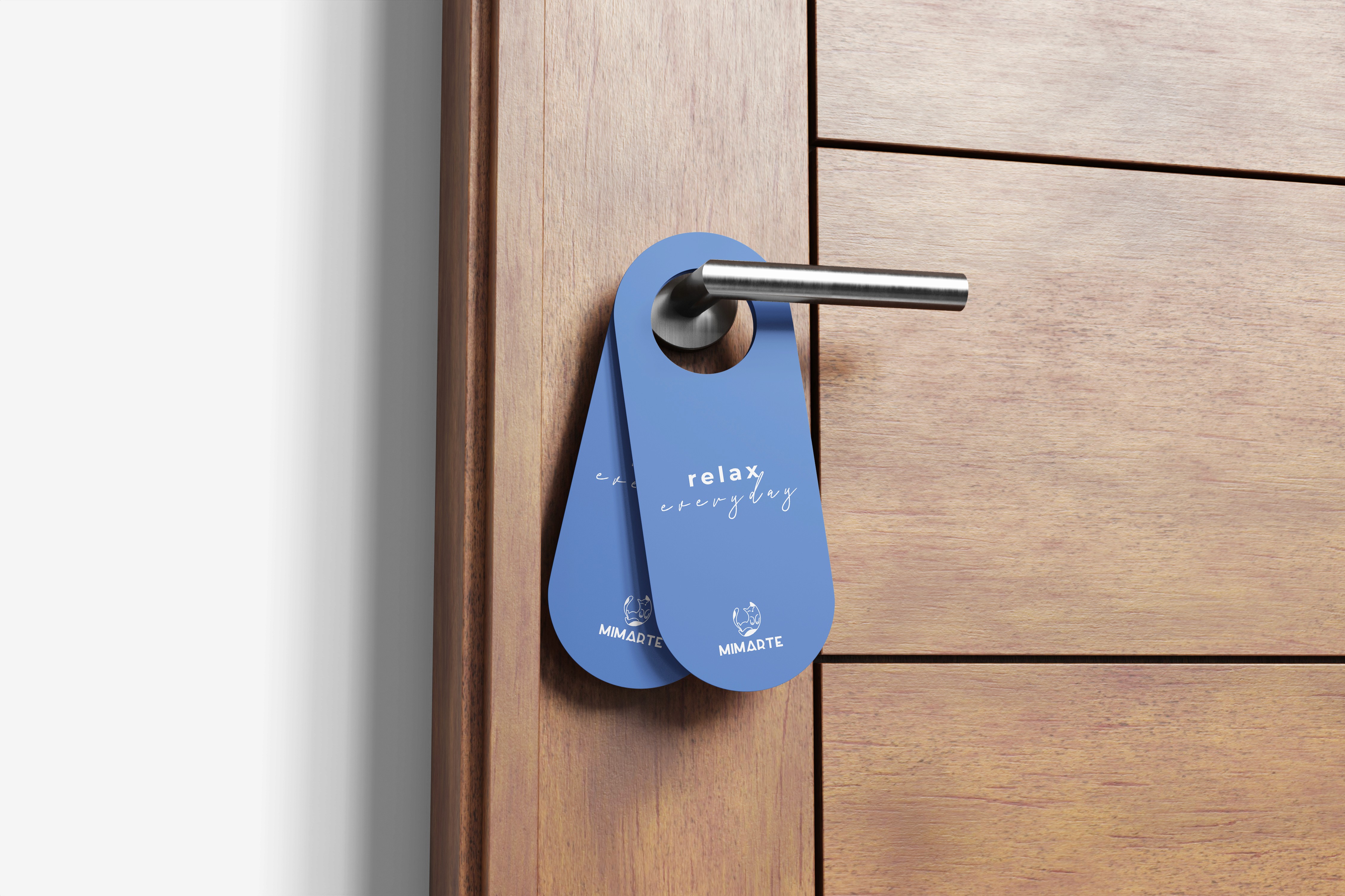
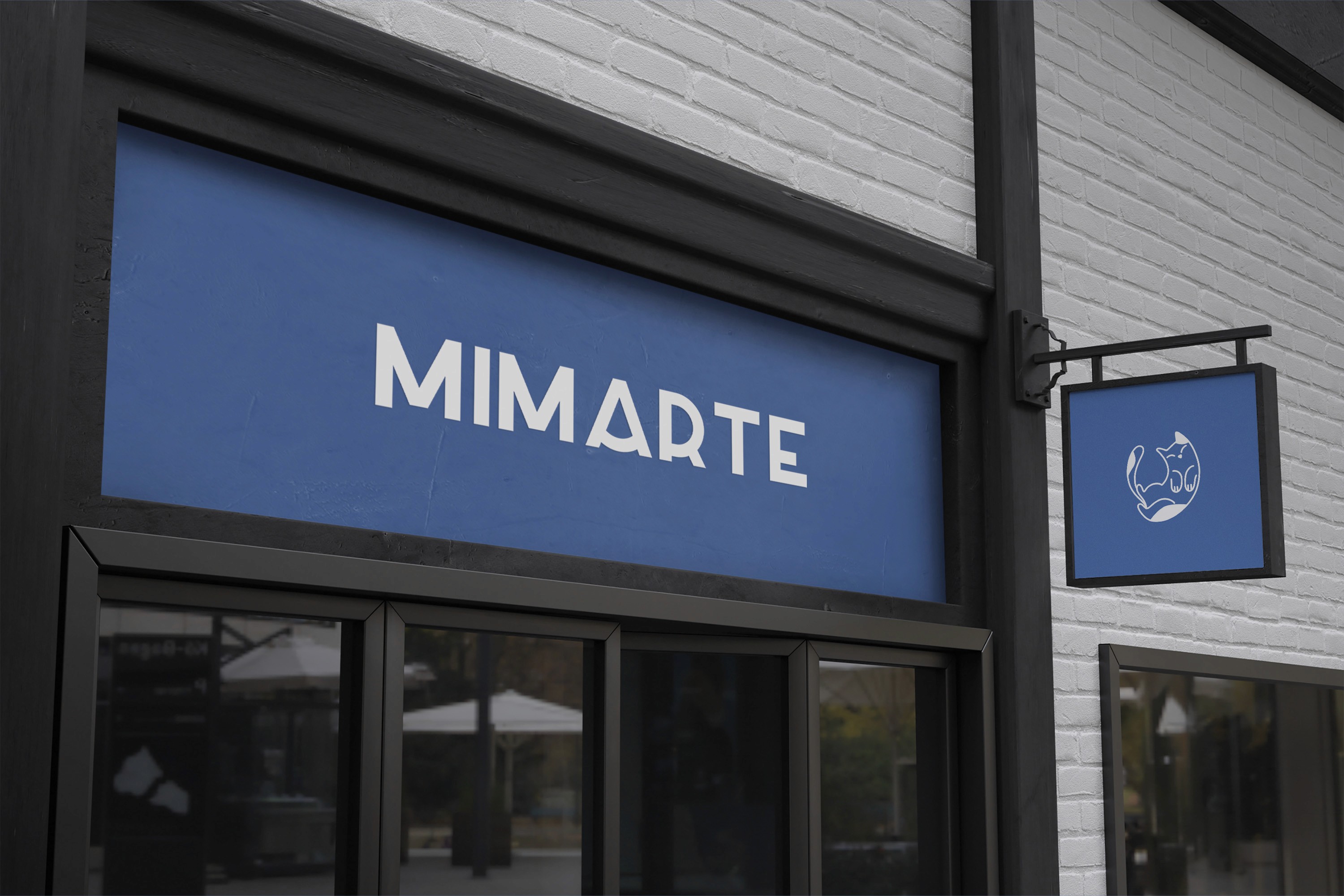
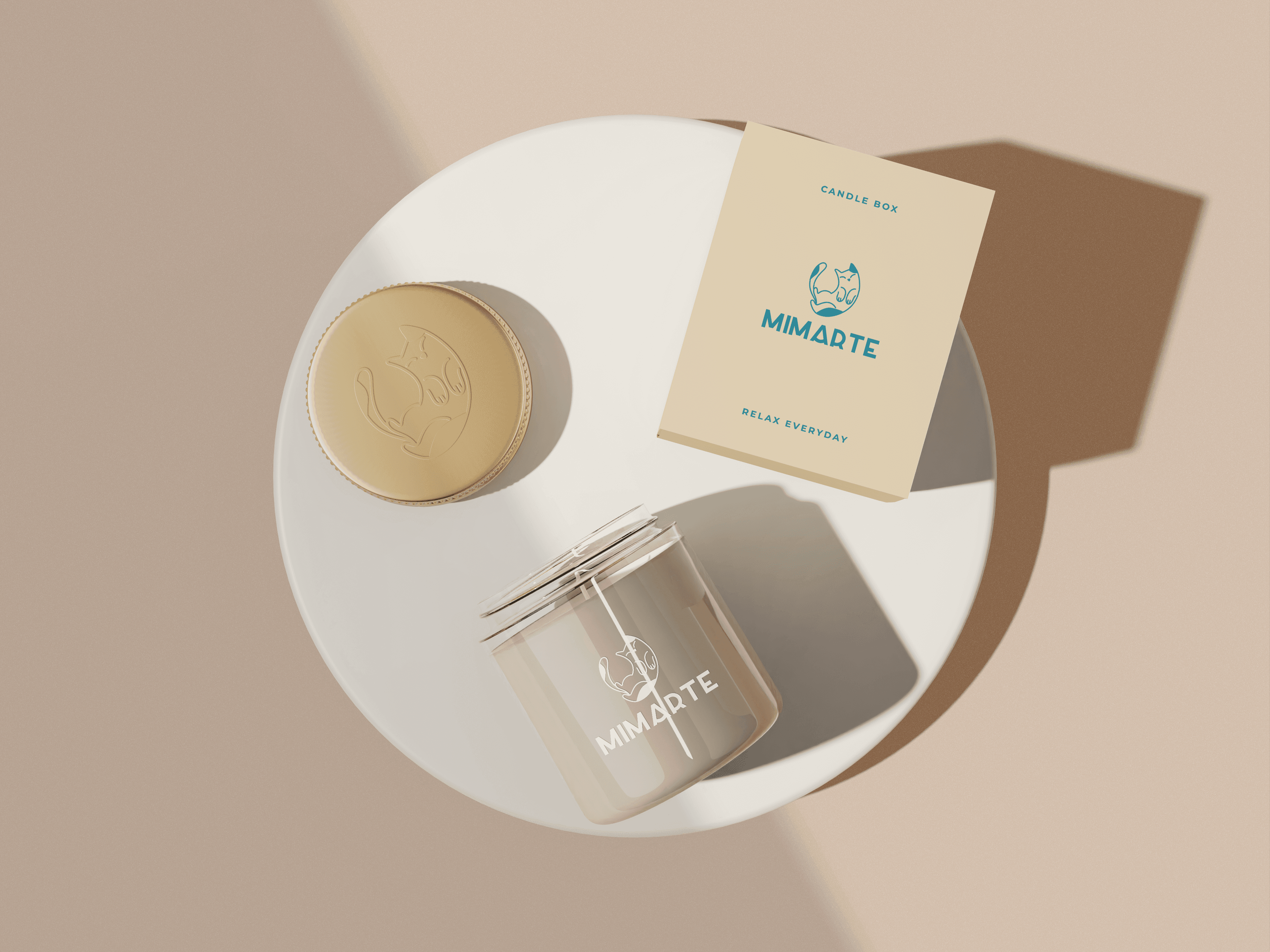
Icon: A stylized cat illustration with flowing lines that evoke softness and calm.
Typography: A friendly, modern typeface to convey approachability.
Color Palette: Soft neutrals and warm accents to create a soothing atmosphere.
Versatility: Designed for use at different scales and in monochrome or color variations.
Accessibility and Optimization
The logo files were prepared in multiple formats (vector, raster) to ensure crisp reproduction across all platforms. Attention to contrast and line weight guarantees clear visibility in both digital and print contexts.
Conclusion
Mimarte is more than a massage service—it’s an experience of relaxation and care. This logo project translated that philosophy into a distinctive visual identity, blending warmth and professionalism to connect meaningfully with clients. By combining thoughtful illustration and clean design, the brand now has a strong foundation to grow and inspire trust.